Brand
The mark is the word.
A gamut is the whole range of something. In colour it is literally the span a system can reproduce, so the identity owns a spectrum rather than a single hue, and the near-black ground exists to make that spectrum read as light rather than as paint.
The mark
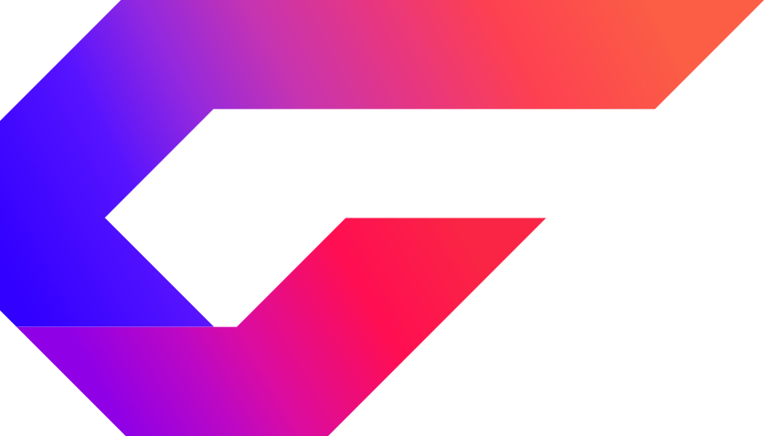
An angular G built from two ribbons that fold through each other. Two shapes, no clipping, 2.3 KB, and still a G at 16 px. The ramp runs blue through violet and magenta into orange; it is the same ramp everywhere it appears, never rebuilt from other colours.
Lockup
The mark stands at cap height with a gap a little under half of it, so the two read as one object rather than two things placed near each other. The artwork carries no margin of its own; that is what makes the gap a space instead of a hole.


The period
The full stop is the ut: it closes the word and carries the identity wherever the mark itself is not present, so it gets its own token and never follows --accent. If it did, the logotype would turn lilac on an artist page and mint on a collective’s. It can also be far darker than any accent, because a 29 px solid square has no legibility to lose.
Tones
A gradient does not survive every context. Full colour where it has room, one flat colour when it is small or single-ink, and knocked out where the spectrum would fight its ground.


The size test
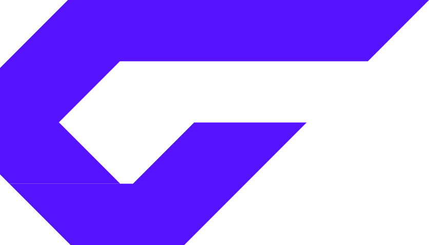
The sidebar renders the mark at 15 px and the favicon at 16. This row decides it: if a shape stops being a G here, it stops being a logo.
The ramp
Seven stops, exactly as the mark was drawn. Used where the identity should be felt rather than read: the mark, a primary action, a playhead, a rule on an edge that matters. It is not an interface palette and never sits behind a paragraph.
- #3100ff0%
- #5613ff21%
- #9228df34%
- #c634b148%
- #e7368163%
- #fd405178%
- #fb5e4599%
The G
Unbounded hangs a stem from the G’s crossbar down to the baseline. Cutting it off does not work, and I tried: the stem is structural, and without it the bowl’s right side hangs open and the bar reads as a tab through a C. So the real choice is to keep Unbounded’s G as it was drawn, or to set the wordmark in a face that never had the stem. Same size, same weight, so the only thing changing is the drawing.
Clean close · no bar, no stem
For comparison · these all put something in the counter
In use
The accent and the ramp as the product actually spends them.
One shared mind
the ramp on a word, never on a paragraphGround and ink
Near-black, never pure, so colour has somewhere to sit.
Brand
- #5613ff
--accentfills: a solid button, a focus ring, a checked box - #9d7bff
--accent-linethe same hue when it has to be read: a label, a hairline, an active icon - #5613ff
--brand-dotthe wordmark's period. Never follows --accent
Ground
- #0a0b0f
--ground-0page - #0f1116
--ground-1panels - #151821
--ground-2hover - #1c202b
--ground-3wells - #262b38
--ground-4inert bars
Ink
- #f3f4f8
--ink-0headings, values - #b8bcc9
--ink-1body - #7d8294
--ink-2secondary - #4b5061
--ink-3labels, hints
Other accents
- #5bc8ff
--iceZenstep - #6df2b1
--mintLazarus Moment, live states - #a48bff
--violetAzaleh - #ff6ba8
--pinkBACKWHEN - #ff5a2d
--emberthe old platform orange - #ffc53d
--amberwarnings only
Do not
- Squeeze the mark into a square or stretch it to fill a box.
- Use the gradient below 24 px. It turns to mud; use a flat file.
- Recolour the ramp, or rebuild it from other colours.
- Put the colour mark on a mid-tone background. It needs near-black or white.
- Use the ramp as an interface palette. One accent governs any one surface.
- Let the period follow
--accent. It has its own token so the logotype is the same object on every surface.
Also drawn
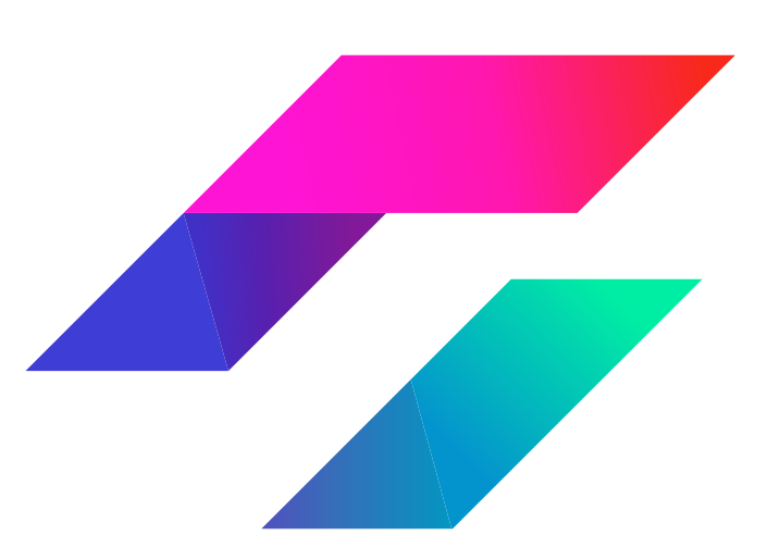
Two parallelograms with a gap, in turquoise through indigo into magenta and red. It reads as a mark before it reads as a letter, which is why it lost, and it is kept because it is still a good drawing: a secondary graphic for a sticker, a loading state, a split avatar. It is not the logo and does not appear beside the word.